
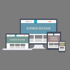 Not too long ago, websites are optimized for desktop and laptops. There are no other devices to view the Lakeland web design but through these massive screens that sit on your desk. However, the past decade alone introduced a plethora of devices that allow you to view your emails, check your social media accounts, browse through websites, and watch videos.That being said, this results to a number of website now incompatible to these new devices you hold in your hands. While other businesses shrug it off and doesn’t see it as an important matter, you need to give it focus if you want your business to succeed. First of all, users are easily irritated when the websites they are trying to view are incompatible with their devices. Since more than 60 percent of Americans are viewing websites on their phones or tablets, you need to make sure your website has a responsive design.
Responsive web design means allowing the sites itself to automatically adjust to any size of the screen. If you’re viewing GMAIL, for example, on your laptop, it will naturally be larger and fuller. But if you are accessing it through your phone or tablet, it will have a mobile version to which it will switch to once you enter the web address.
A responsive Lakeland web design will also adjust to the user’s needs. If you haven’t upgraded your website yet, now is the best time to do so. Hire a web designer that can turn your website into a responsive one, so that your customers won’t get annoyed by the font size, layout, etc. that would not fit on the screens of their phones.
Why is this consistency important? Take this as an example: A user is viewing Macy’s on her laptop. She was looking for a new pair of boots. However, she was disrupted and had to continue her browsing on her mobile phone while she was commuting back home or to work. Macy’s has a mobile version of their website, so it makes it easy for the user to switch to her mobile phone. However, if it did not have a mobile version, there is a good chance the user will just open another website (Nordstrom, for example) that has a mobile version. Macy’s, then, would have lost the chance to make a good sale.
Since April 2015, Google designed its search engine to rank websites with mobile version higher. That means that if your website has a mobile version, it is more likely to appear on top of the search results. Remember that this works only for responsive web design. If you have a multitude of platform (one for desktop and another for mobile device), the algorithm that Google introduced won’t work at all.
Lastly, as a business owner, you have to be prepared for the future. Who knows what kind of technology will surprise us in the years to come? If you already adjusted to a responsive web design, that makes it easier for you to modify the website when a new trend comes along.
Recent Comments