
 Aren’t you curious why certain colors are used in Lakeland web design? There is a science to color and if you want to have a website that can attract clients, then you should know how to use colors to your advantage.It’s easy enough to understand how it works: yellow means joy and a sunny personality while violet is for unity, right? The problem is, colors, depending on cultures and a government’s political affiliation, can mean different things. In various countries in Asia, violet or purple means mourning or death while yellow is for freedom. The colors may also depend on a society’s political and social strata.
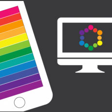
But when it comes to Lakeland web design, the meaning of colors are quite basic. Here are some of the most important and basic colors and what they mean:
Red
For some cultures, red is the color of war and love. But how can you use this web design? Red is usually for warning signals. On websites, a web designer can use this color to announce changes or even a sale. It always has the power to catch the attention of any viewers, readers or visitors.
The moment a website opens, it can immediately hold one’s attention by using red on either the image or the text.
Black
While black symbolizes negativity in some cultures, web design see it on a different light. It’s professional and formal, and designers can modify and tweak with it a lot in order to produce a website that reflects the personality of a brand. A lot of automobile sites use black as their main color because it’s manly and look very official. They also use this color when they are just about to launch a website. Rarely do websites use white or red to announce its launch.
Also, if your website needs to be artistic, when it sells artsy stuff, there is no better scheme to use than black and white. It always has that classic appeal that seems to scream elegance and sophistication.
Pink and blue
While many websites on makeup and women stuff use pink as their main color, we often overlook the subtle blues on the edge of the pages, the fonts, the images and graphics, etc. This is because pink and blue are both attractive to women. Web designers prefer using these, along with mint green, for websites that cater to women’s needs.
Recent Comments